
You know what I’m talking about: a Claude generated UI. This was before some of the design skills were available @ github, but I have yet to see AI designs rival a human eye.
This is the initial UI. I didn’t care about looks because I was more concerned on function.

When I attacked the UI issue, my prompt was something like, “remove the emojis from the buttons. make the shape of the buttons such that two opposing corners are sharp and the other opposing corners are round. remove the gradient background.” I wanted to see what Claude came up with. It produced 3 proofs:


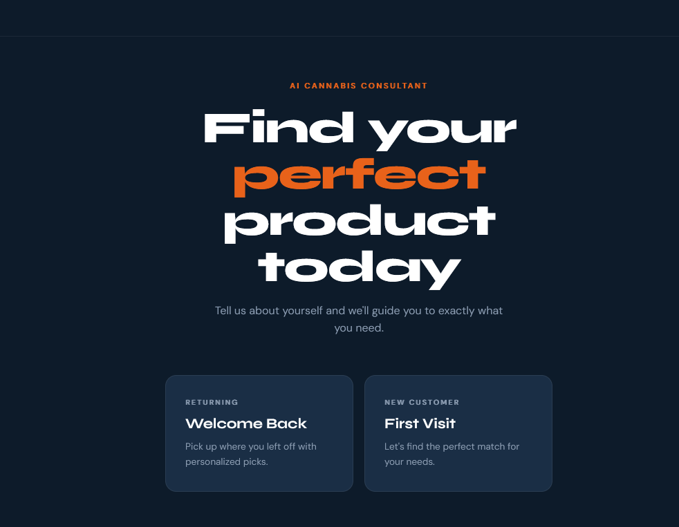
Yuk. I was iterating in between, but could not produce the results I wanted. I’ll freely admit I may not have been articulating well. But, I do have some skills with Photoshop and it was just easier for me to mockup a design rather than polish my English.
I decided on a large, broad font, Eurostile. I found a cool smoke background, but didn’t want to use the cliché green or gray for the smoke. Here’s the mockup I chose:
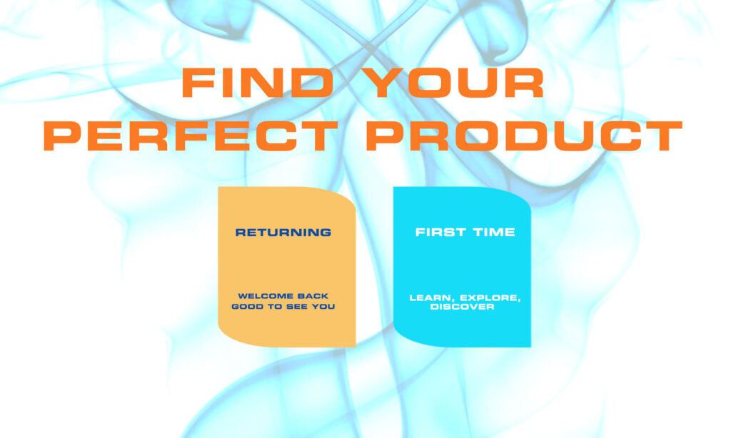
It’s changed slightly over the development, but this is what I was aiming for. The shape of the buttons is a subtle, modern shape of a leaf (leaf being a whisper towards cannabis). You see it? It was too difficult to describe it to Claude, much faster to do it in Photoshop.
Sometimes the fastest path to getting what’s in your head is bypassing language altogether.